
Cerebral
Website Redesign
Goal - Mature brand, simplify website, clarify offering and make mobile friendly
Part of the brand evolution started with the data we gathered from the home page A/B test. The illustrated landing page performed much better than the standard vector art control. However, to scale the changes, we began with incremental changes; we started by updating the vector art to customized, branded illustrations within the website, the onboarding experience, and eventually within the product.
Helping the cerebral brand mature
We focused on building a visual language that scaled with the limited resources of our design team. By auditing the experience, we established a new photographic style and outlined rules around using imagery over vector art to humanize the experience and be more welcoming. Overall, we started to build with more intentional use of white space and contrast to build a more accessible, grounding, and calming experience.
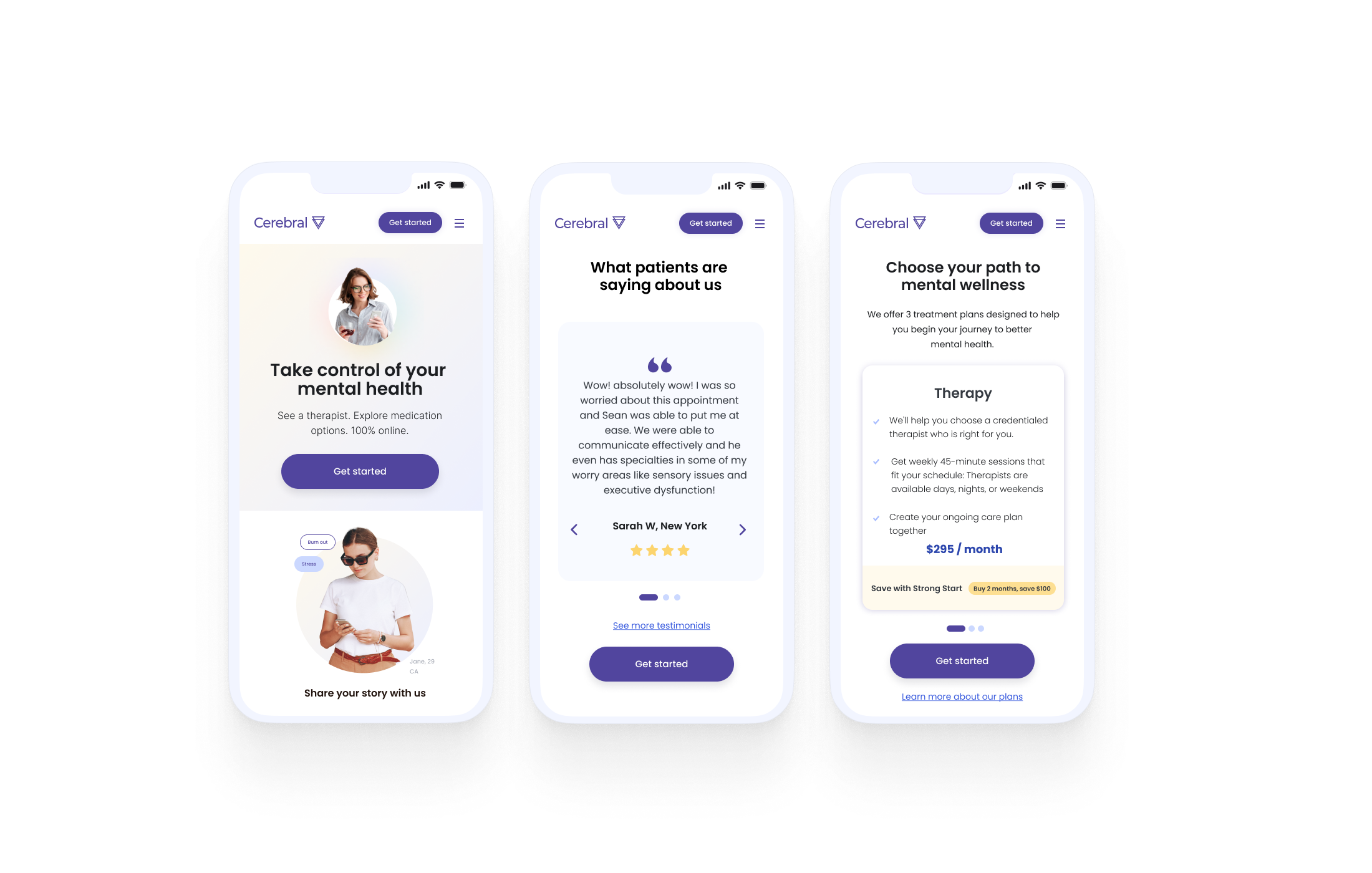


Orignal homepage + A/B Tests and Winning A/B test that launched the general overhal

Application of updated illustration that eventually lead to the updated photographic style and application throughout the experience.
Build consistency, build trust.
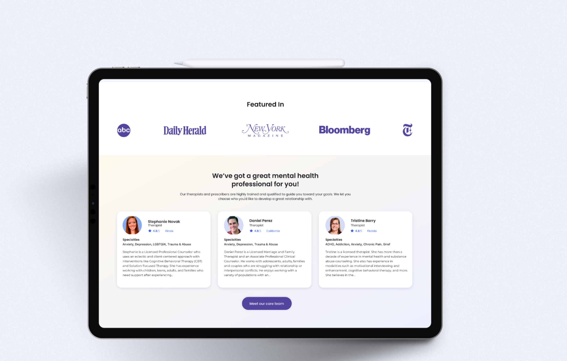
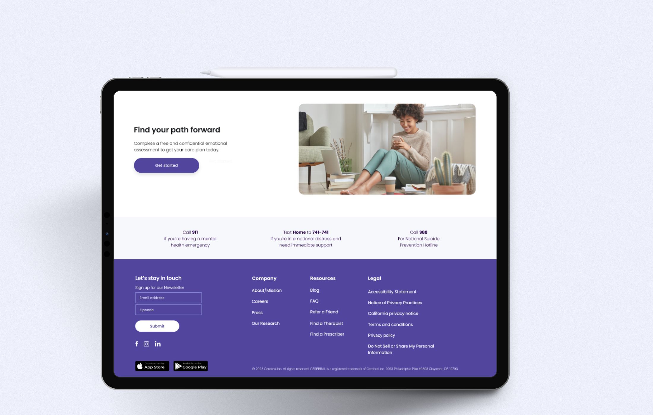
Scalable solutions | After auditing the Cerebral site I Designed various modules that could be repurposed throughout the website.
Explore Past Projects

UCSF iPad App + Branding

Scott Brothers DIY Ditties - Esurance
SFMTA App + Dashboard

Citizenshipworks Platform + Branding

PARISOMA Redesign

Digital Illustrations - Esurance

Allstate + Esurance Co-branding