Cerebral Website Redesign
Build consistency build trust.
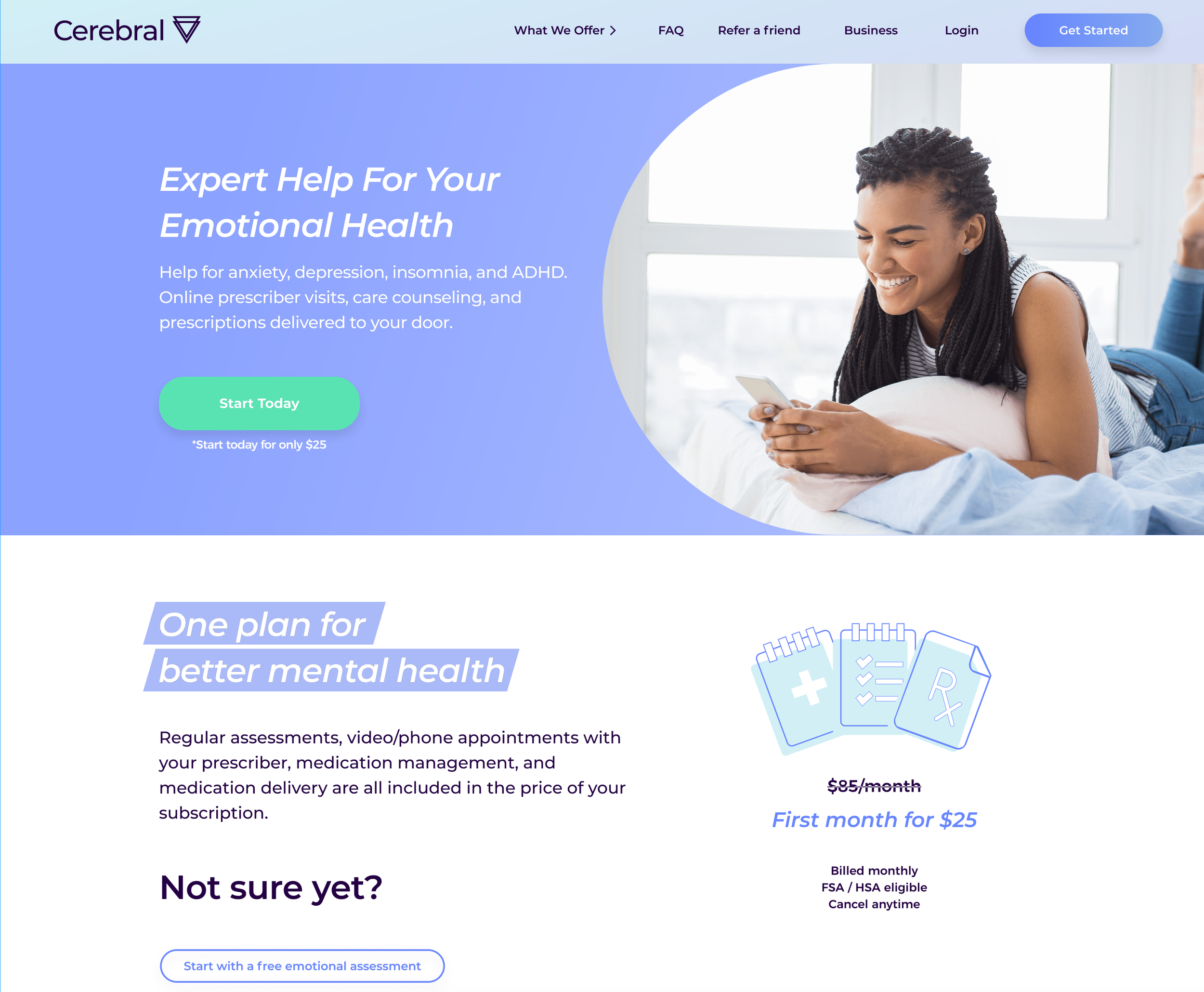
What it looked like before….
Winning AB Test
Helping the cerebral brand mature
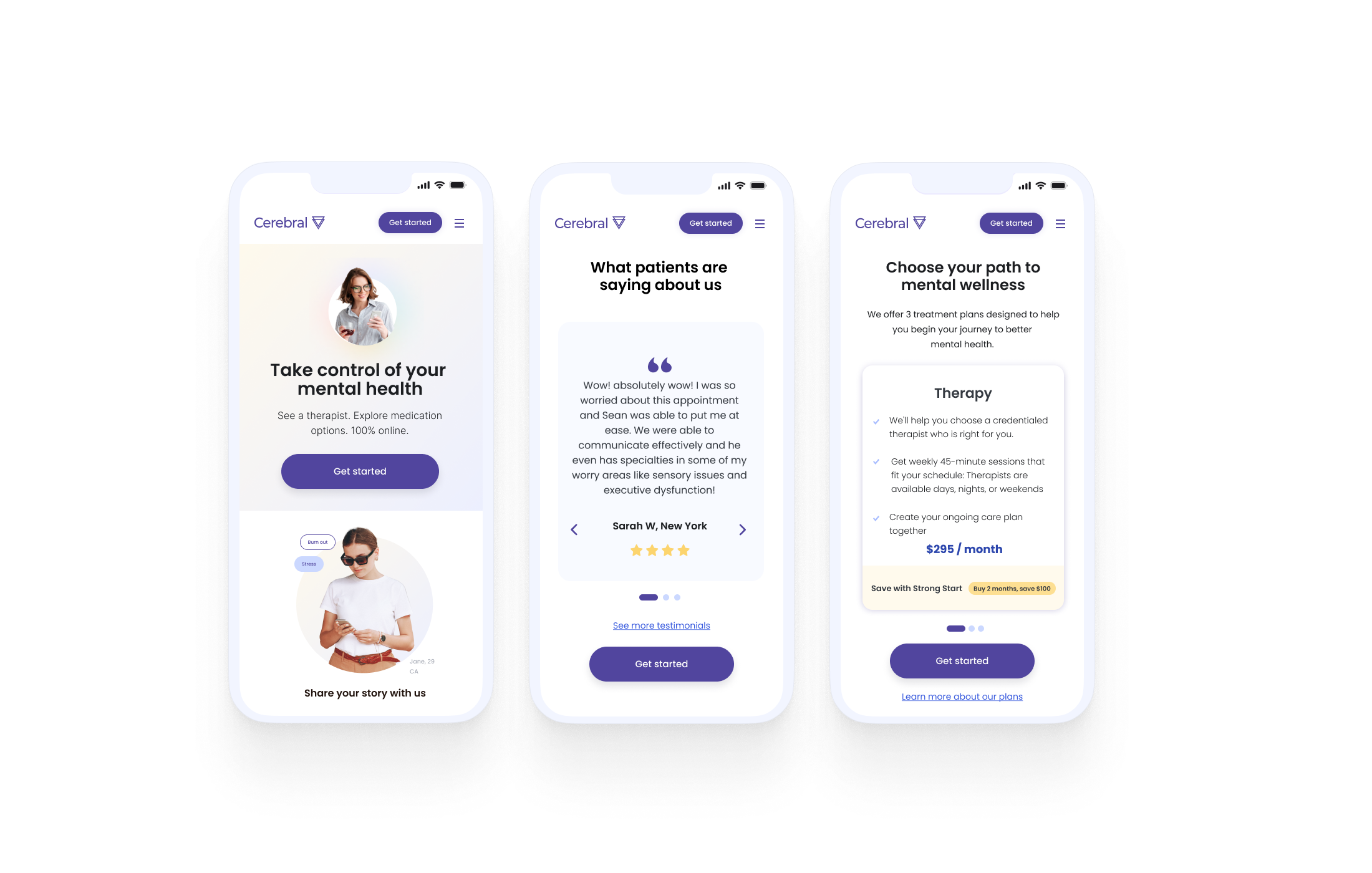
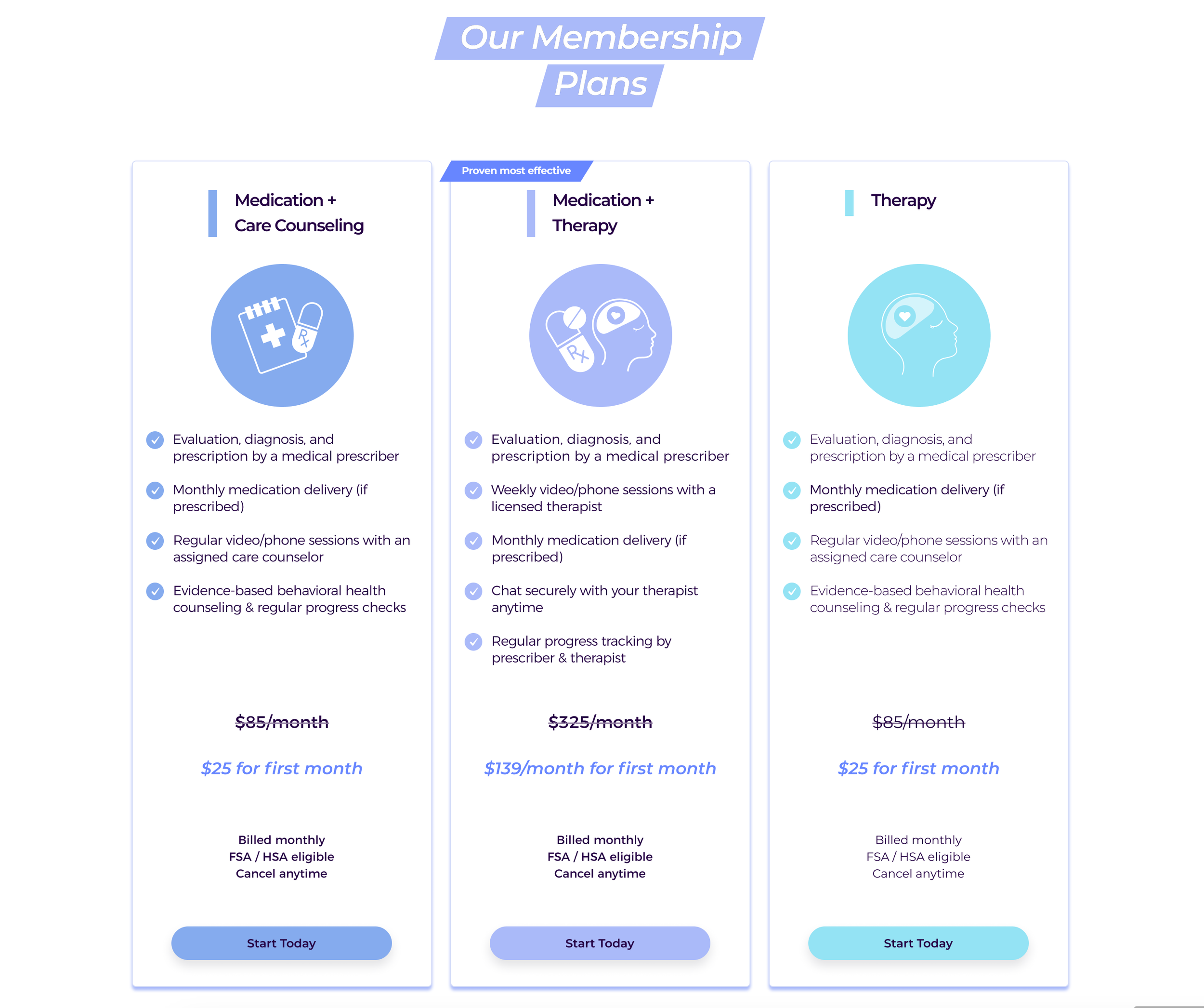
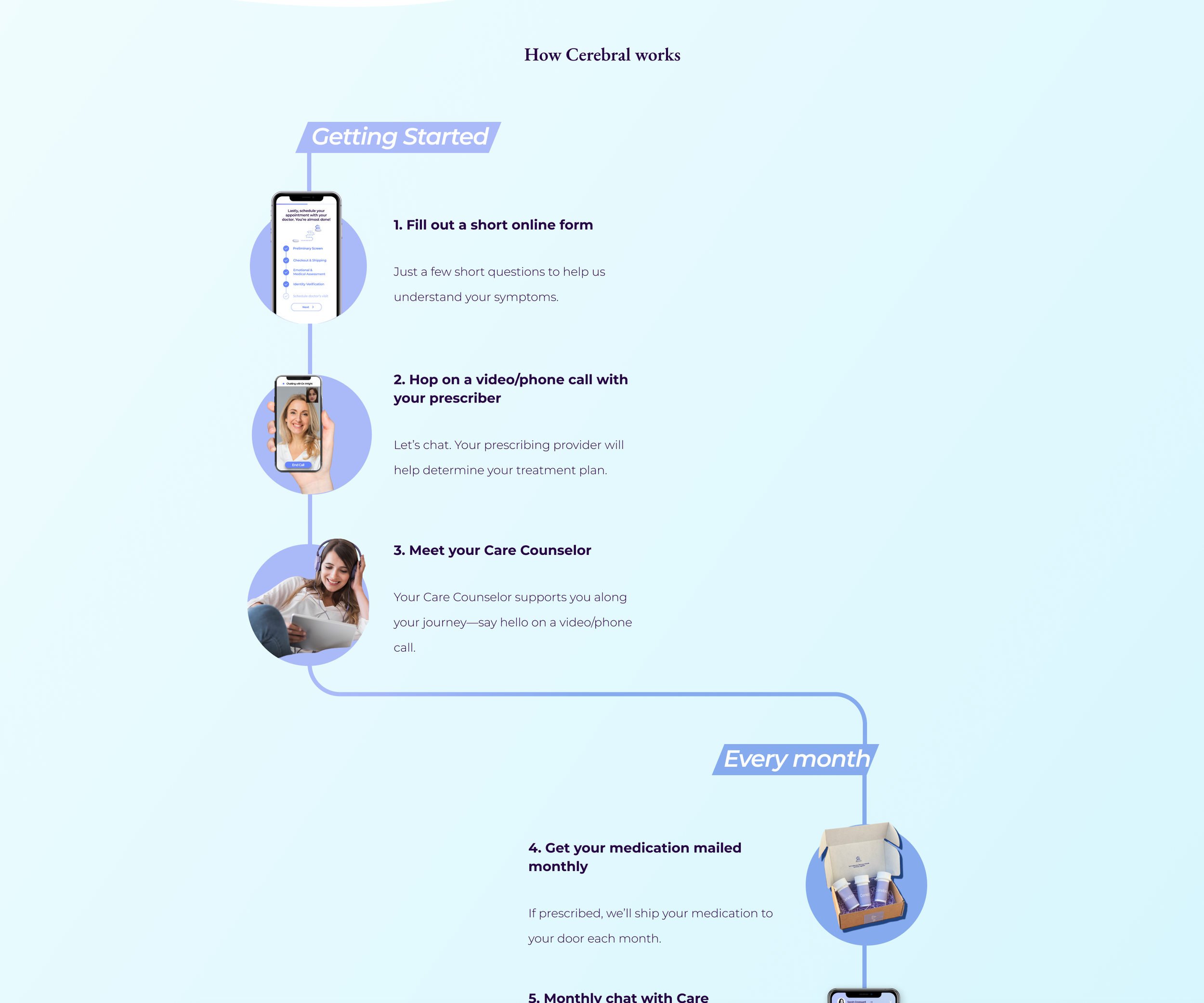
Part of the brand evolution started with the data we gathered from the home page A/B test. The illustrated landing page performed much better than the standard vector art control. However, to scale the changes, we began with incremental changes; we started by updating the vector art to customized, branded illustrations within the website, the onboarding experience, and eventually within the product.
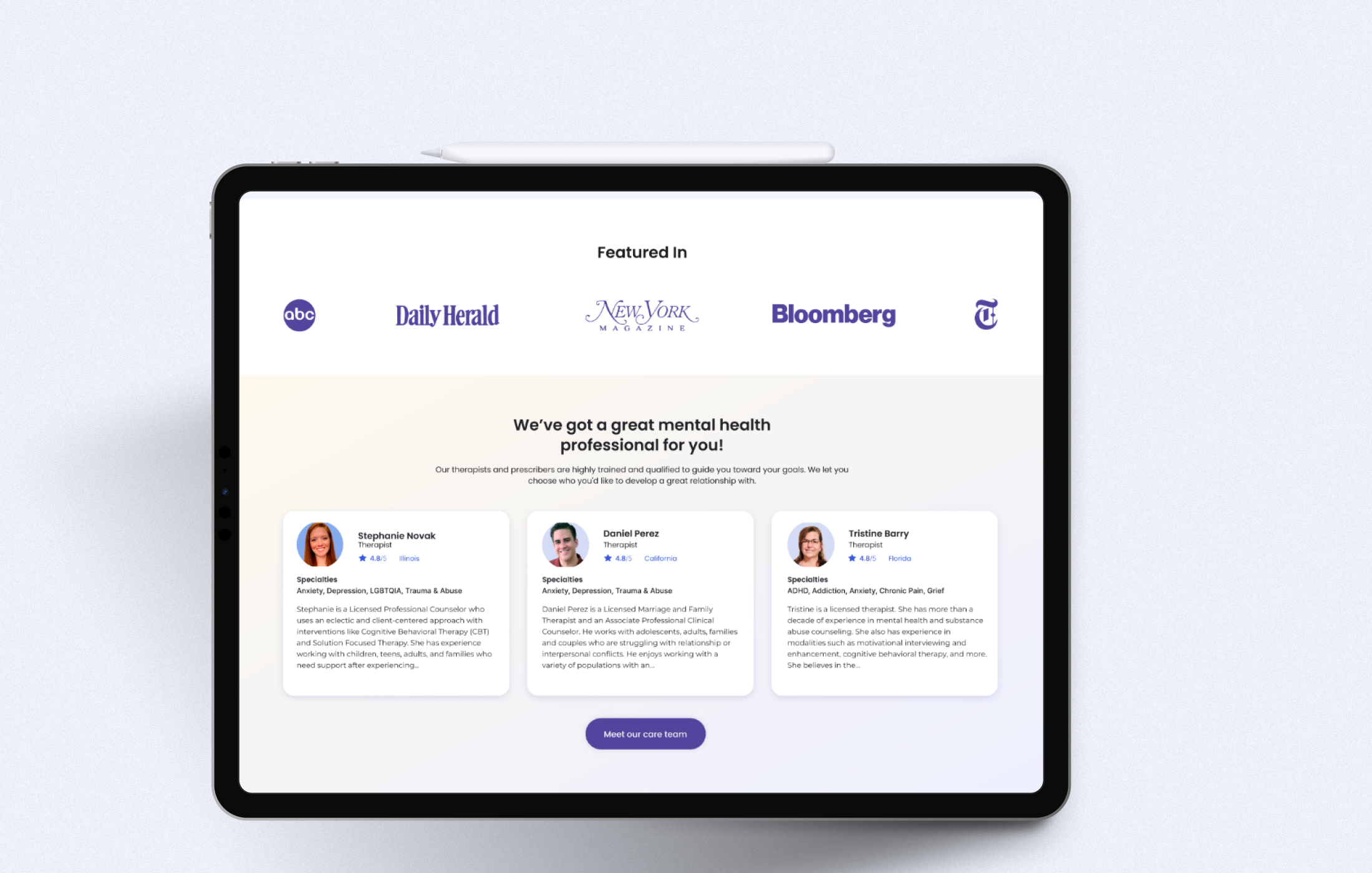
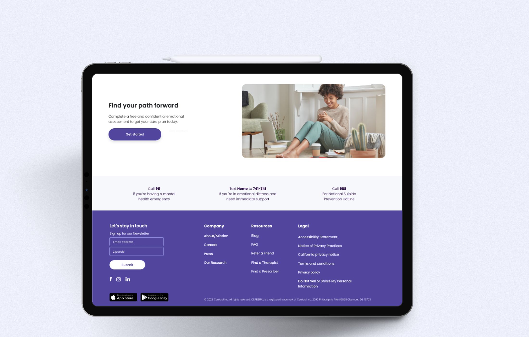
We focused on building a visual language that scaled with the limited resources of our design team. By auditing the experience, we established a new photographic style and outlined rules around using imagery over vector art to humanize the experience and be more welcoming. Overall, we started to build with more intentional use of white space and contrast to build a more accessible, grounding, and calming experience.


